Favorite Foods by the Month
Role: Design, Web Development
Collaborators: Maggie Ma, Adam Grant
Duration: 6 weeks
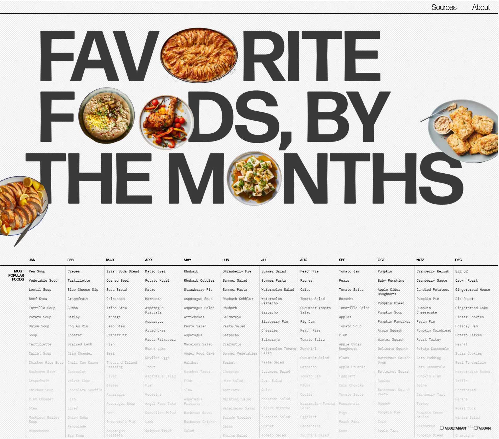
Favorite Foods by the Months – a recipe resource and data exploration website. Drawing from Google Trends and NYT APIs, it displays the ‘trendiest’ foods in each month.
PROJECT OVERVIEW
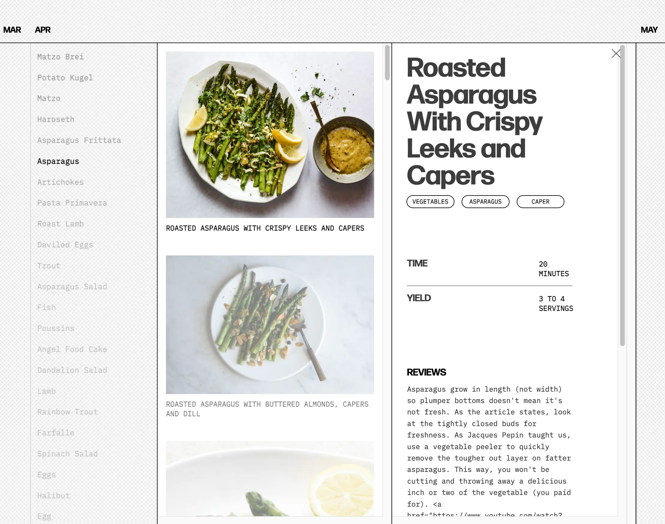
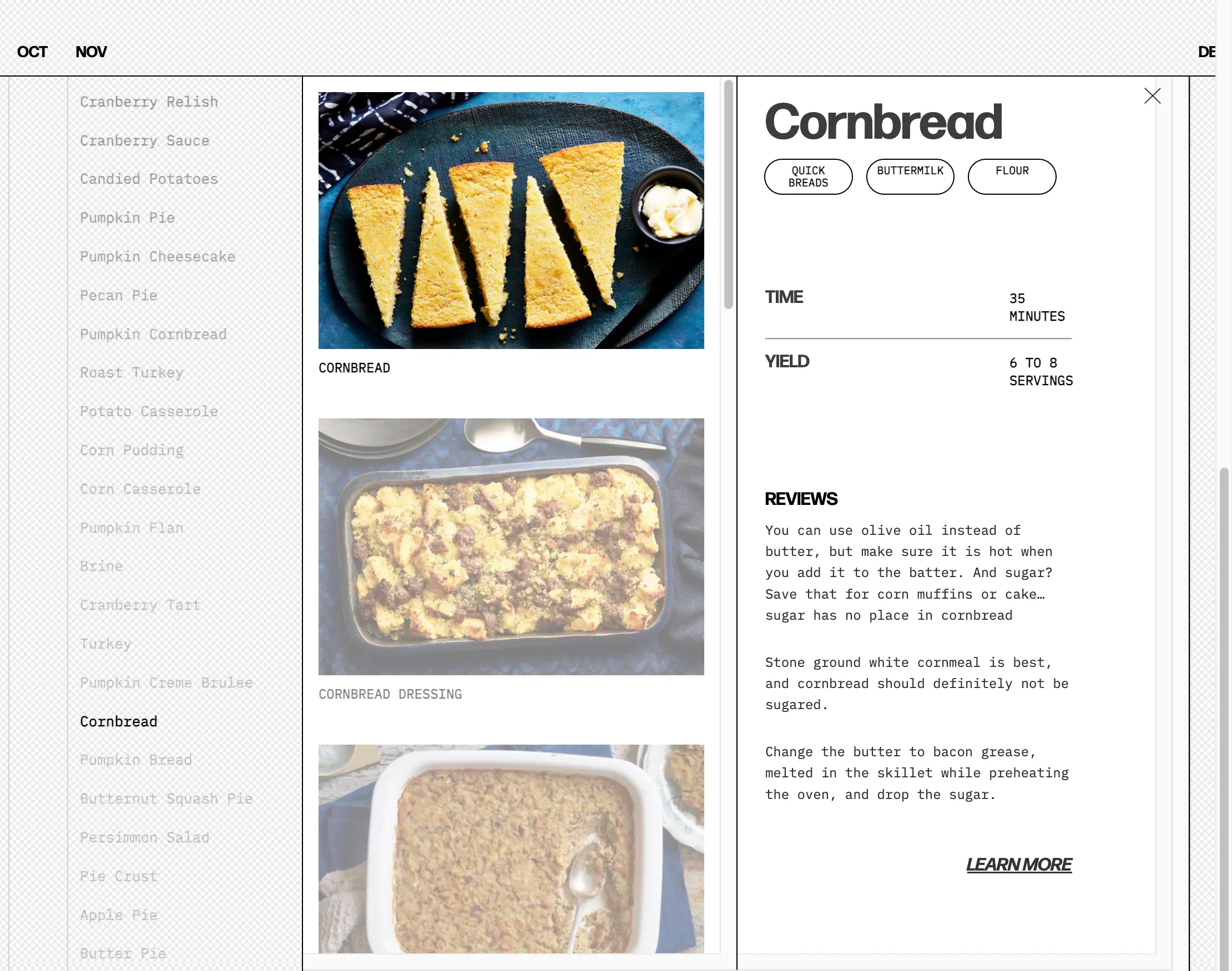
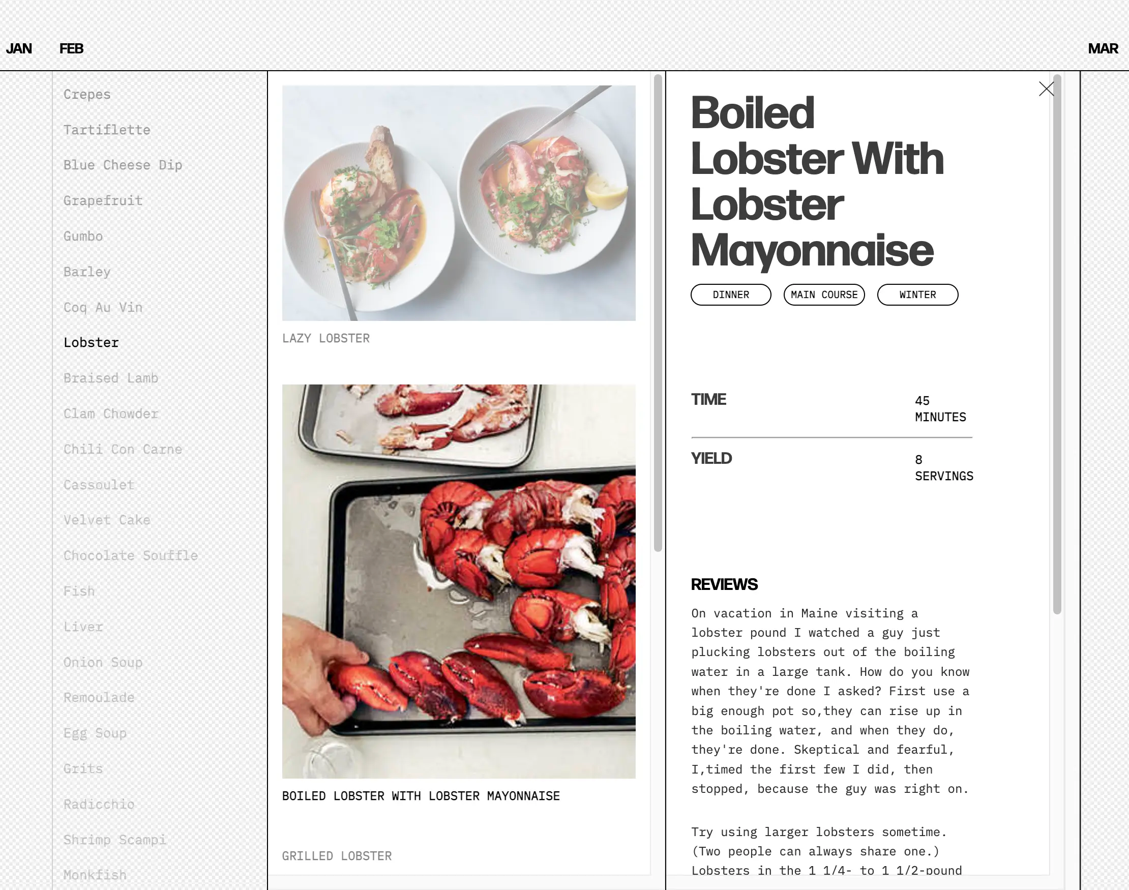
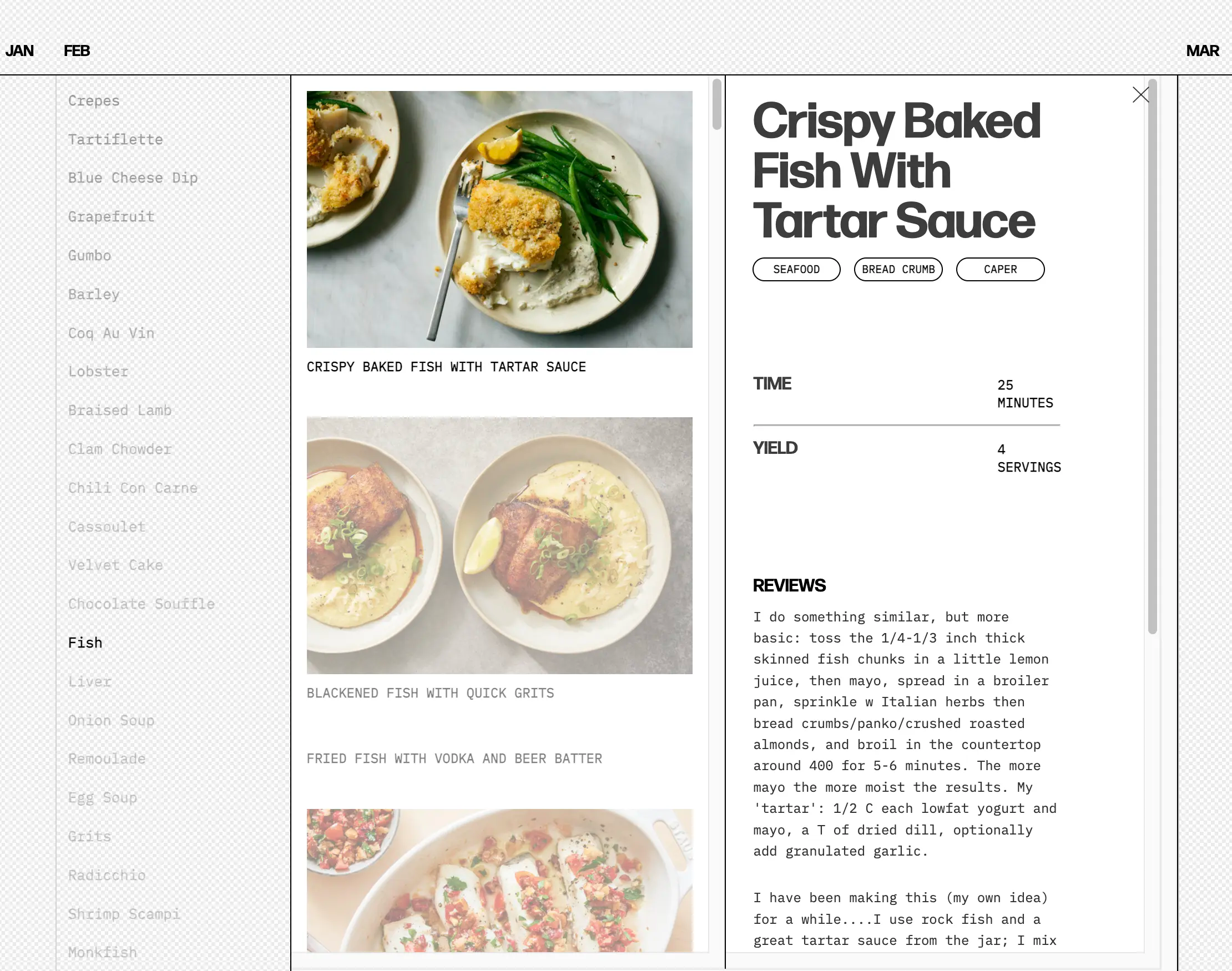
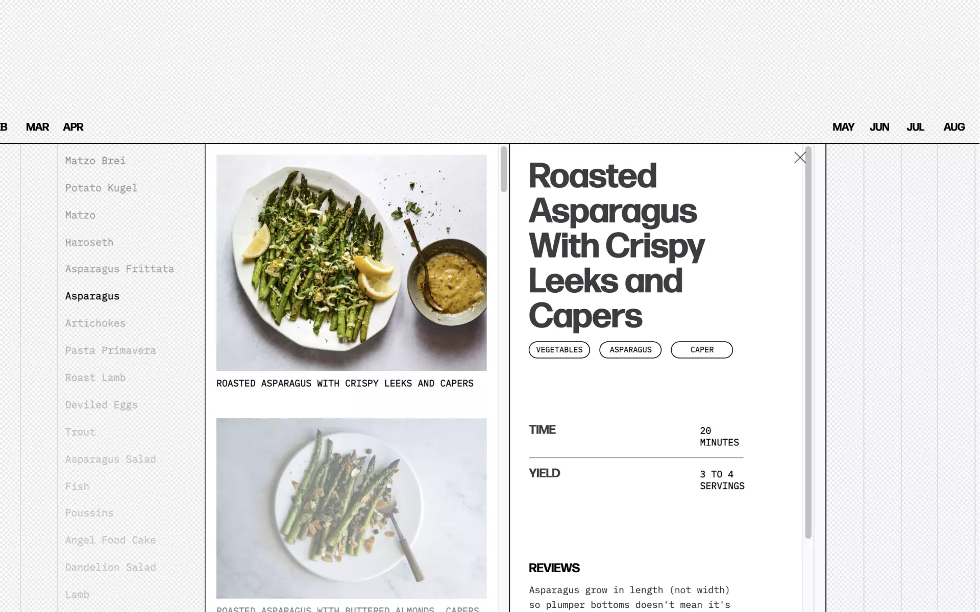
Scrolling down from the introduction page, visitors are presented a timeline of the months of the year with the trendiest foods of each month listed in descending order. Selecting a food expands the column to list specific recipes for that food. Along with a thumbnail and brief description, visitors are linked to the full recipe on NYT Cooking.
Our final result seeks to modify the relationship between the visitor and the act of looking for a recipe. For most of human history, people were limited to the ingredients grown in their location and at that time of year with the recipes passed down to them. Today, globalization has given us access to nearly any food in any season with millions of recipes on the internet. We now group food with categories like cuisine, healthiness, spiciness, and so on. To some degree, factors like seasonality and local availability have become more of a preference than a restriction. Favorite Foods by the Month seeks to highlight the seasonal, monthly, or even holiday based nature of food by centering the connection between food and time once more.
PROCESS OVERVIEW
TOBI’s organs were inspired by work in the soft robotics field. Each organ is a hollow silicone structure with multiple chambers that are pneumatically actuated by air pumps and valves controlled via Arduino. Designing the form and movement of each organ, I drew from various forms I saw in the real world, particularly in sea creatures and microbiology as well as normal human organs. I looked for a range of forms and actuation that could accommodate discrete and continuous data with a consistent aesthetic while also maintaining a certain degree of relatability.
With the forms mapped out, I moulded and casted each organ dozens of times to nail the process and create the visceral effects I wanted. I also needed assemble the electronics and physical housings complete TOBI’s physical form.
REFLECTION
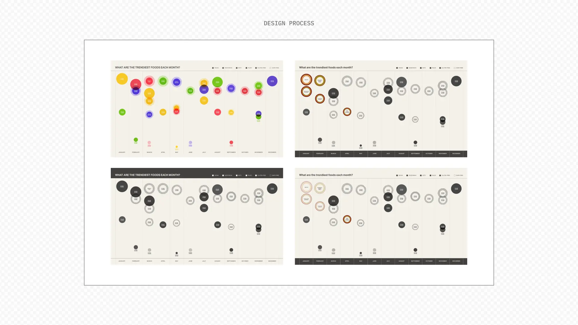
On the front end, we coded everything in the website with native HTML and CSS. Originally, we had planned to create embedded graphs and visualizations with p5.js canvases, however, feedback sessions with users showed that they produced more visual clutter than useful insight. Looking back on the process with my current knowledge, using a framework like react or svelte would have sped up the development and increased our options for interaction.
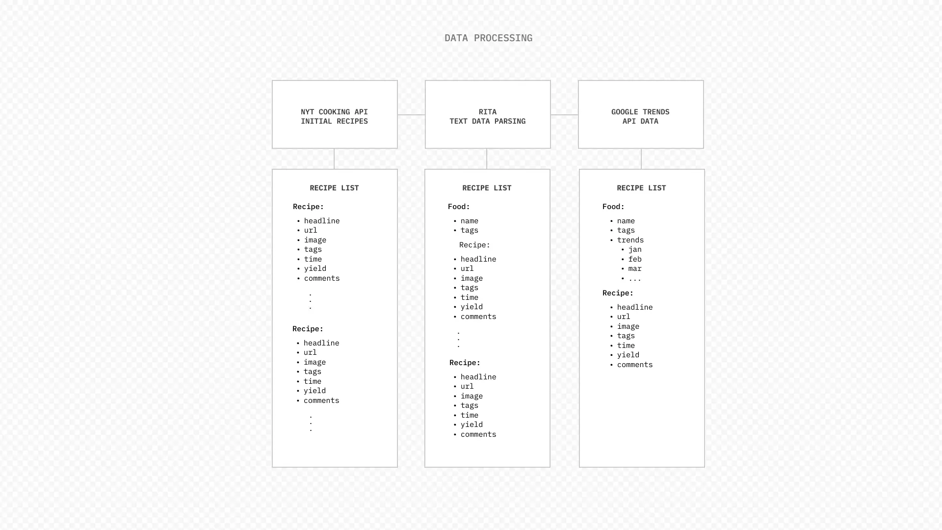
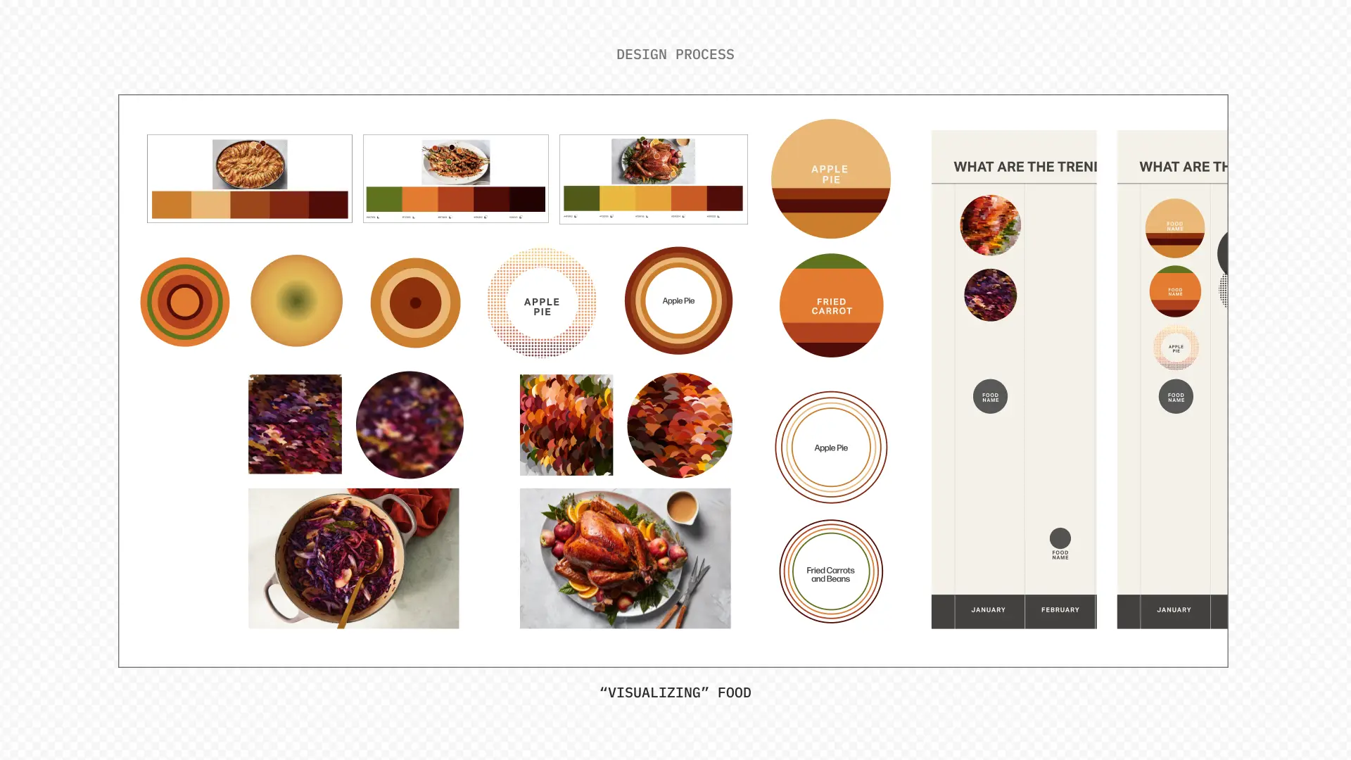
Working on Favorite Foods by The Months provided an interesting challenge from both the design and development perspectives. Iterating on the website’s UI/UX, we sought to make the website as informative as possible at each stage without being overwhelming. On the development side, we learned to process data through API and to serve and display that data through the front and backend portions of a website.
