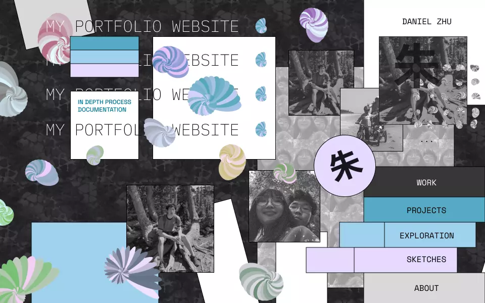
portfolio
Role: Design, Development
Collaborators: N/A
Duration: Ongoing
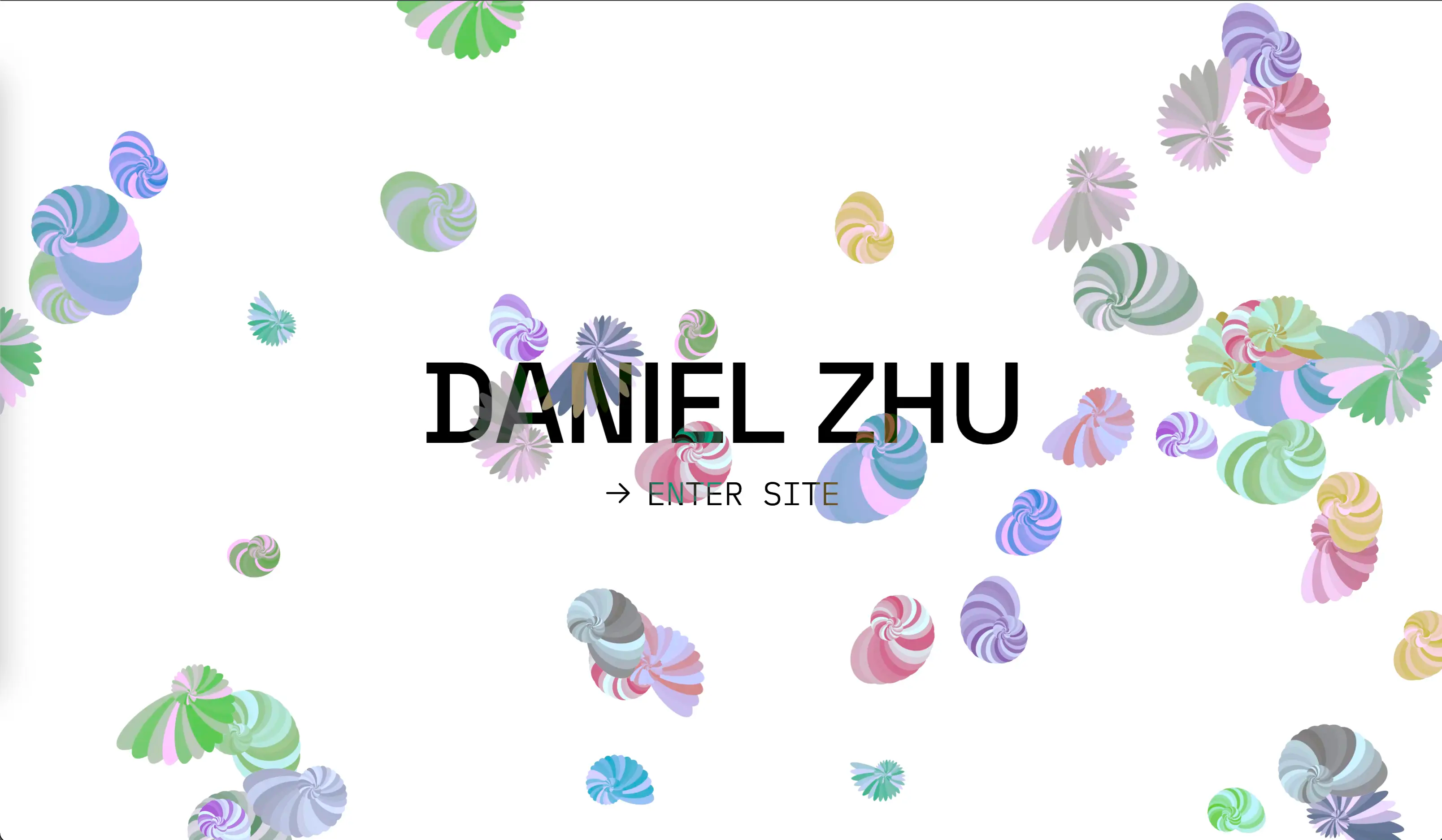
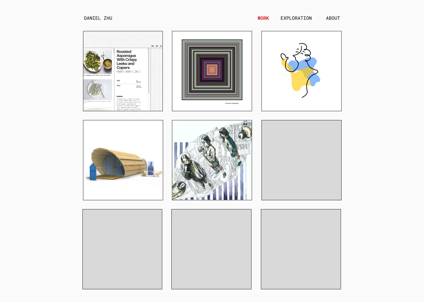
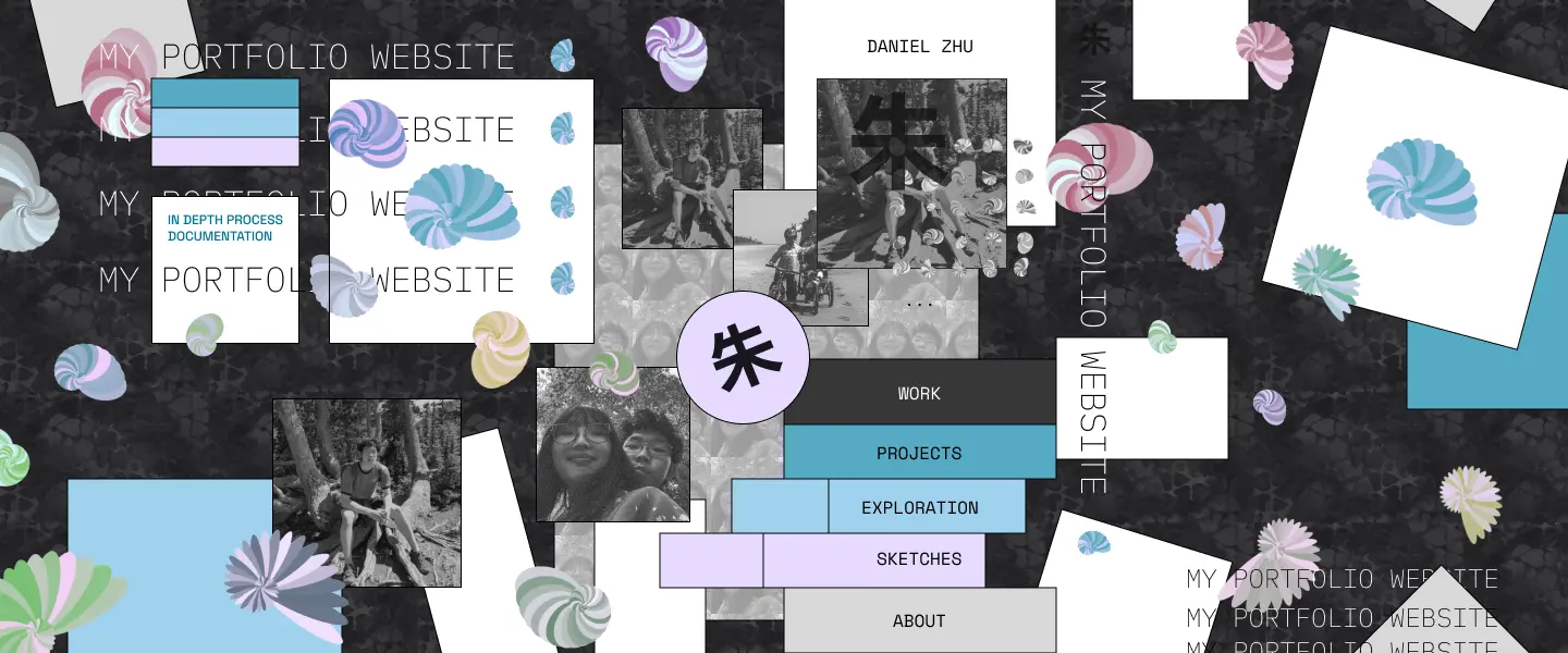
Welcome to my portfolio website! In this site, I’ve assembled a collection of my work, but also present a vision of how personality and interactivity can be injected into ordinary sites.
PROJECT OVERVIEW
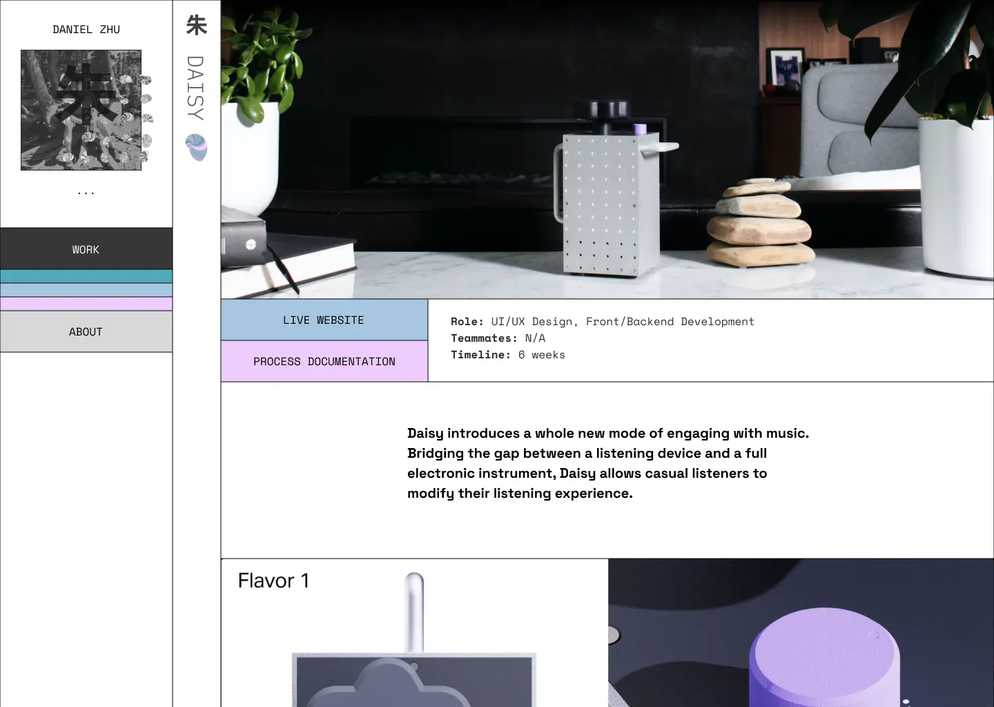
So, what’s with this page? In many ways, this site has become a project in itself. As a designer, coder, and all around curious person, I took it upon myself years ago to slap together my own website and it’s been growing and evolving since then.
Starting with early figma prototypes and sketches, I iterated over a number of designs before implementing it in code. This site was built with Svelte.js on the frontend and deployed with Vercel. Interactive animations and assets were largely produced with Processing or p5.js and combine prerendered content with a live code.
Along with being a showcase of my work, this site serves another agenda. One of my deeply held beliefs is that the web (where silly things like physics don’t apply) should be filled with fun and character. With Processing, p5.js, and Svelte, I’m continuously exploring how this site can embody that sense of play :)
PROCESS OVERVIEW
Over the course of the last few years, this site has gone through several major aesthetic overhauls. Early on I explored a skeumorphic desk-like interface, one that was near and dear to my heart. However, my techical skills at the time led me to abandon that concept at the time for a more standard and quickly implementable approach.
As I was worked to build my aesthetic and technical capabilities, I gradually cycled through a few stock designs as I learned how to code with more advanced frameworks and developed an look and feel that I felt fit my personality. Fresh off the more abstract desk design, I decided to start with standard formats for readability and ease of understanding.
Eventually as I gained more experience, I settled on the current visual style. Starting with a basic grid and templated system, I’ve gradually added more movement, color, and other bells and whistles. While each pages has become more dense and colorful, I’ve tried to keep the core legibility in mind, challenging my understanding of hierarchy and other design principles with dynamic colors, animations, and other content.
WHATS WITH THE SHELLS?
During my project Organic Forms, Artificial Rules, I discovered a way of generating a content for consistent and interesting aesthetic that I felt would be perfect for branding my site.
The shell motif first started when I picked up the book “Theoretical Morphology” by George R. McGhee Jr abandoned in a hallway at CMU. It presents a fascinating look into a mathematical perspective behind how the body plans of organisms can be modeled and predicted, both the plans that exist now but also ones that could theoretically exist had evolution nudged them in a slightly different way.
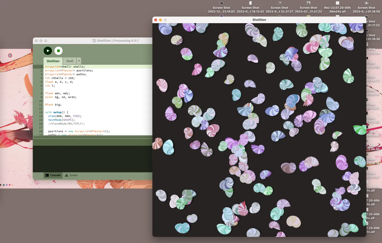
Among the various discussions in the book, I was particularly struck by a chart of how shell shapes morph as you change the parameters behind the model behind their construction. Building off of the formula provided as well as making my own tweaks from my own experimentation and research, the first shell generator was born in Processing. I was fascinated with how a little randomness here and there in the parameters could produce such disperate shapes and sizes. Making a few changes for aesthetic purposes, I started adapting the generator for use in my website.
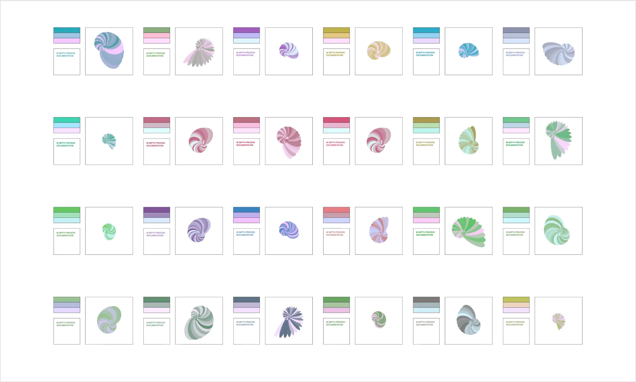
Included above are twenty shells generated in processing which I played with to identify four colors: a primary, secondary, tertiary, and text highlight color. These twenty prerendered shells became visual building blocks for the site you see now with the colors and images associated with each shell providing the color palettes of the site.
INTERACTIVITY
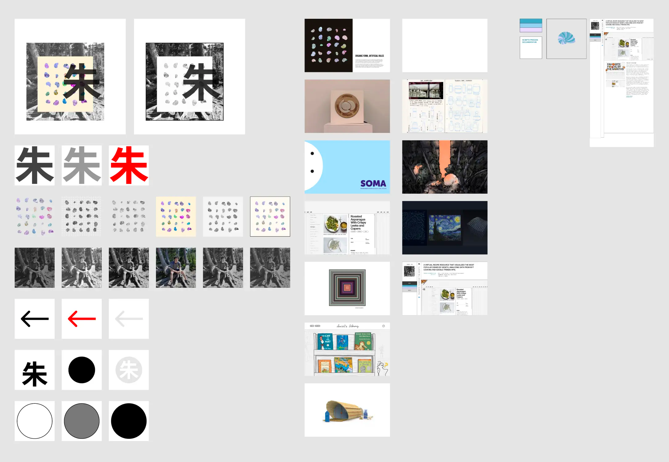
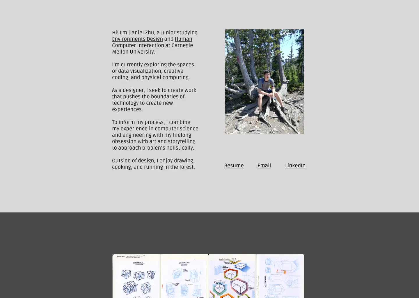
One of the unique challenges of working with interactive code has been conceptualizing, planning, and prototyping interactions that would only fully emerge in code. Above I’ve included a peek into the planning for one of these elements - the about page.
I used a number of tricks to aid in the prototyping process. For example, before adapting the Processing code to p5.js I took screenshots of a processing prototype with different densities, background colors, and other placements to import into Figma to help me decide on the visual direction even without having a live version of the code. Because there aren’t design prototyping tools with creative code, this type of website takes a lot of experimentation to develop a workflow and style that works for you.
REFLECTION
Working on this portfolio website has been one of my longest running exercises, improving my visual design and coding skills. I’ve had so much fun working on implementing fun ideas without any restriction and learning technical skills that have become applicable to other projects I’m working on. I am currently working to refine the site and rebuild the site with sveltekit to provide opportunities for more ideas that require more involved backend integrations.
